Perun
Package Design
2023
Project Overview
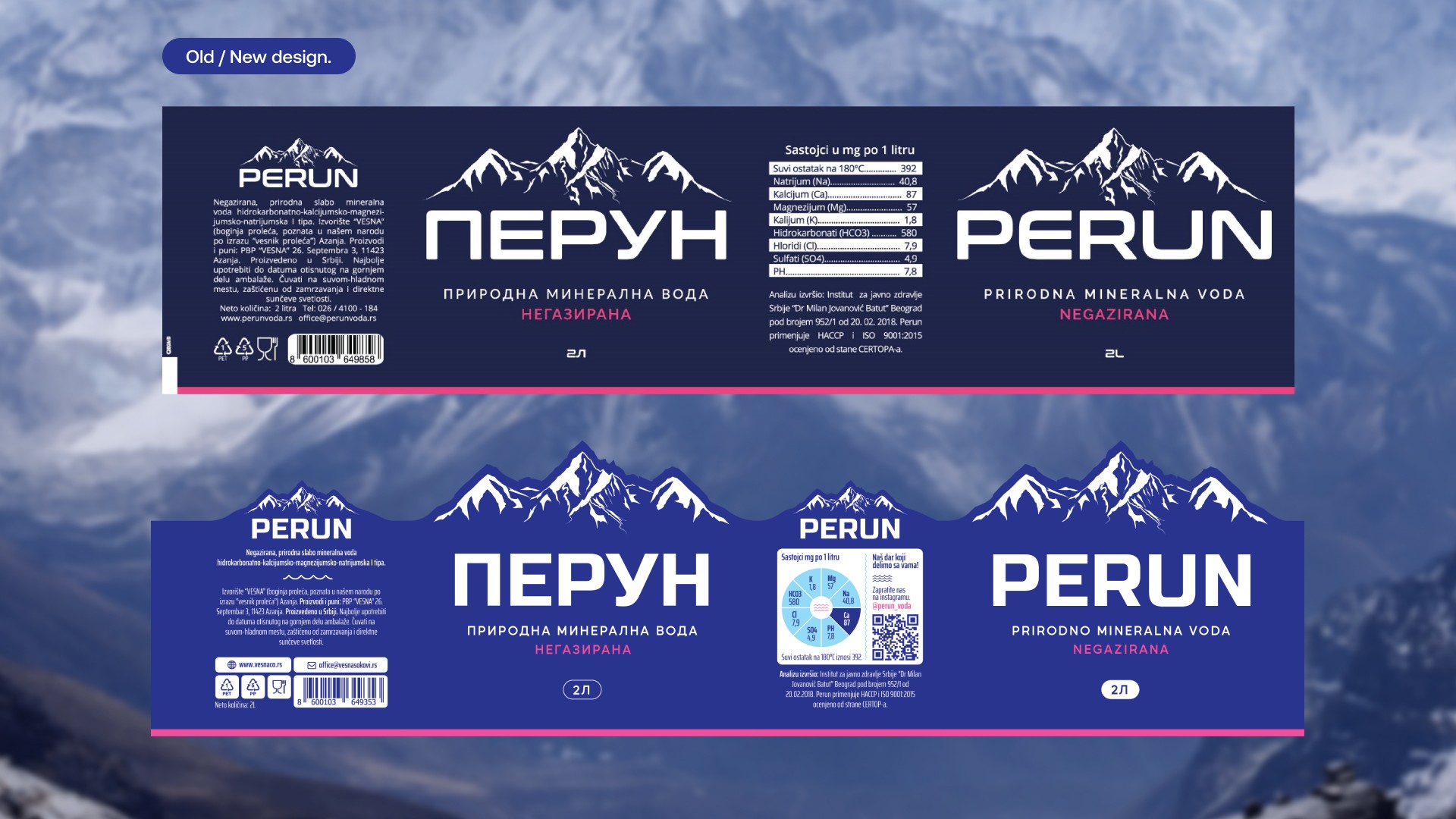
Perun's identity was rooted in its appeal to an older population and its positioning as a commercial brand. Our redesign aimed to maintain this traditional charm while infusing a touch of modernity. The owner's vision to add a transparent element to the label, while incorporating the brand's iconic mountain-inspired logo, set the stage for an innovative yet familiar design.
The brand's focus on a traditional, affordable, and accessible identity necessitated a strategic visual overhaul aimed at capturing the attention of its target audience predominantly in smaller towns and locations.
The Problem
Our goal was to introduce a transparent element to the label while modernizing its overall appearance. Additionally, we needed to refine the label's information design to ensure clarity and effectiveness.
Process
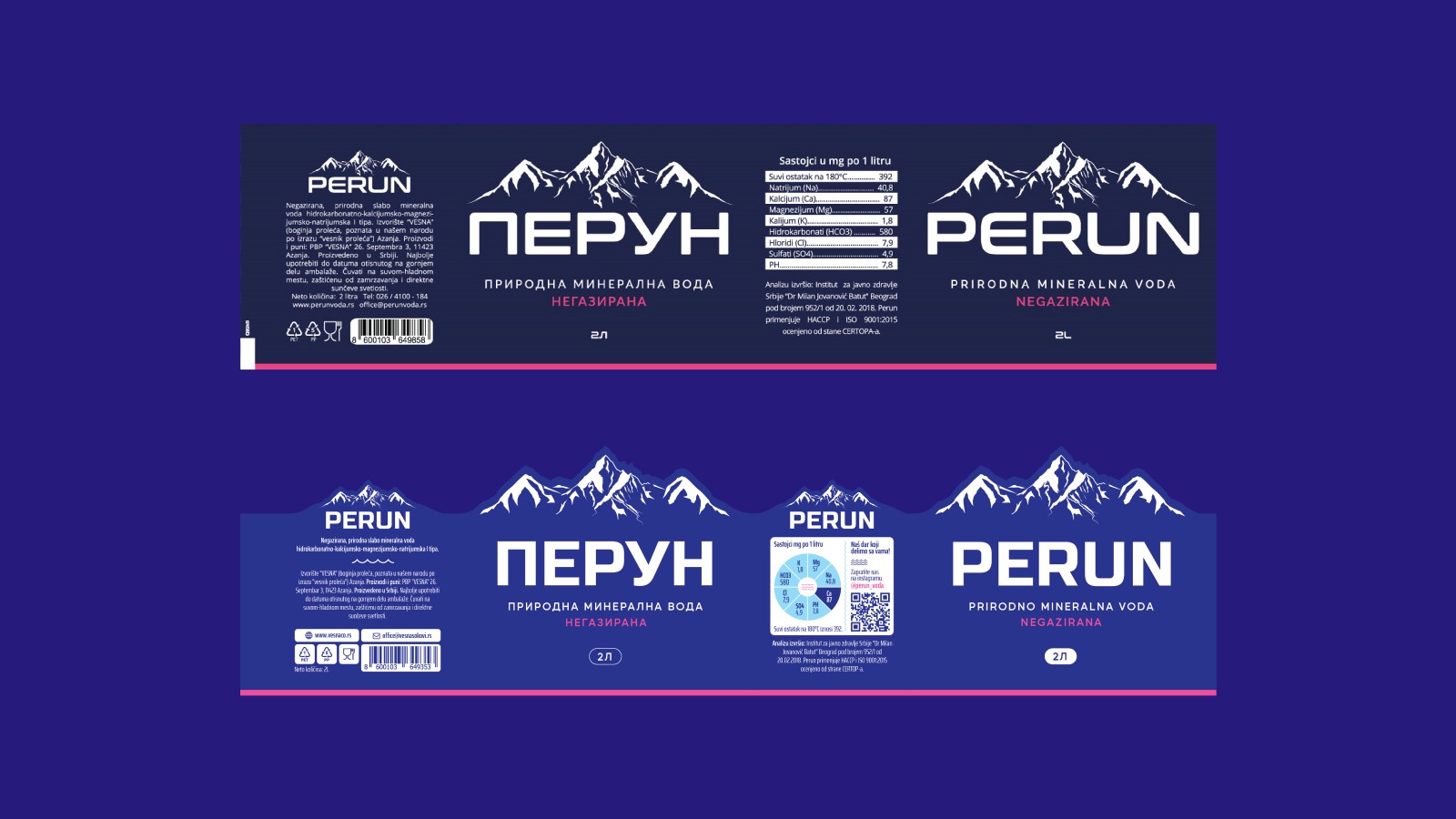
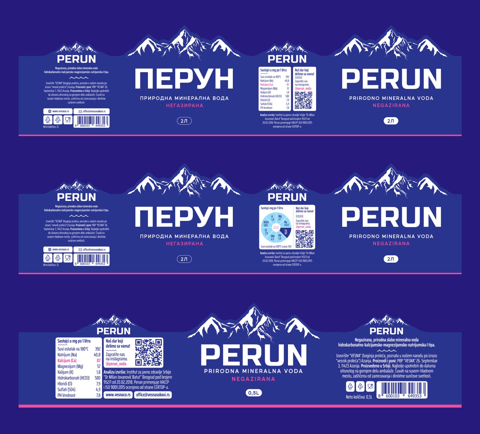
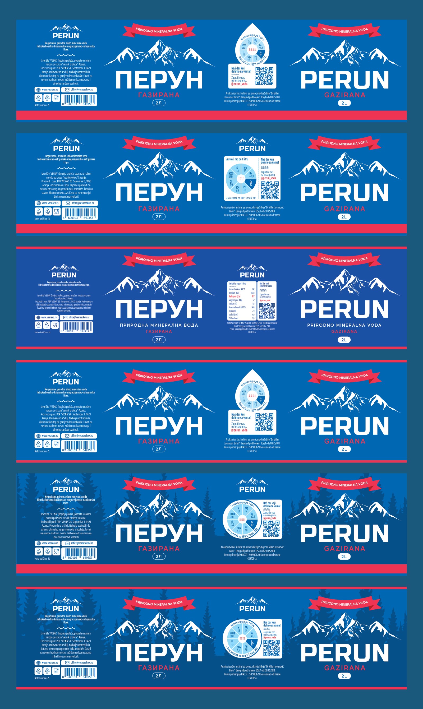
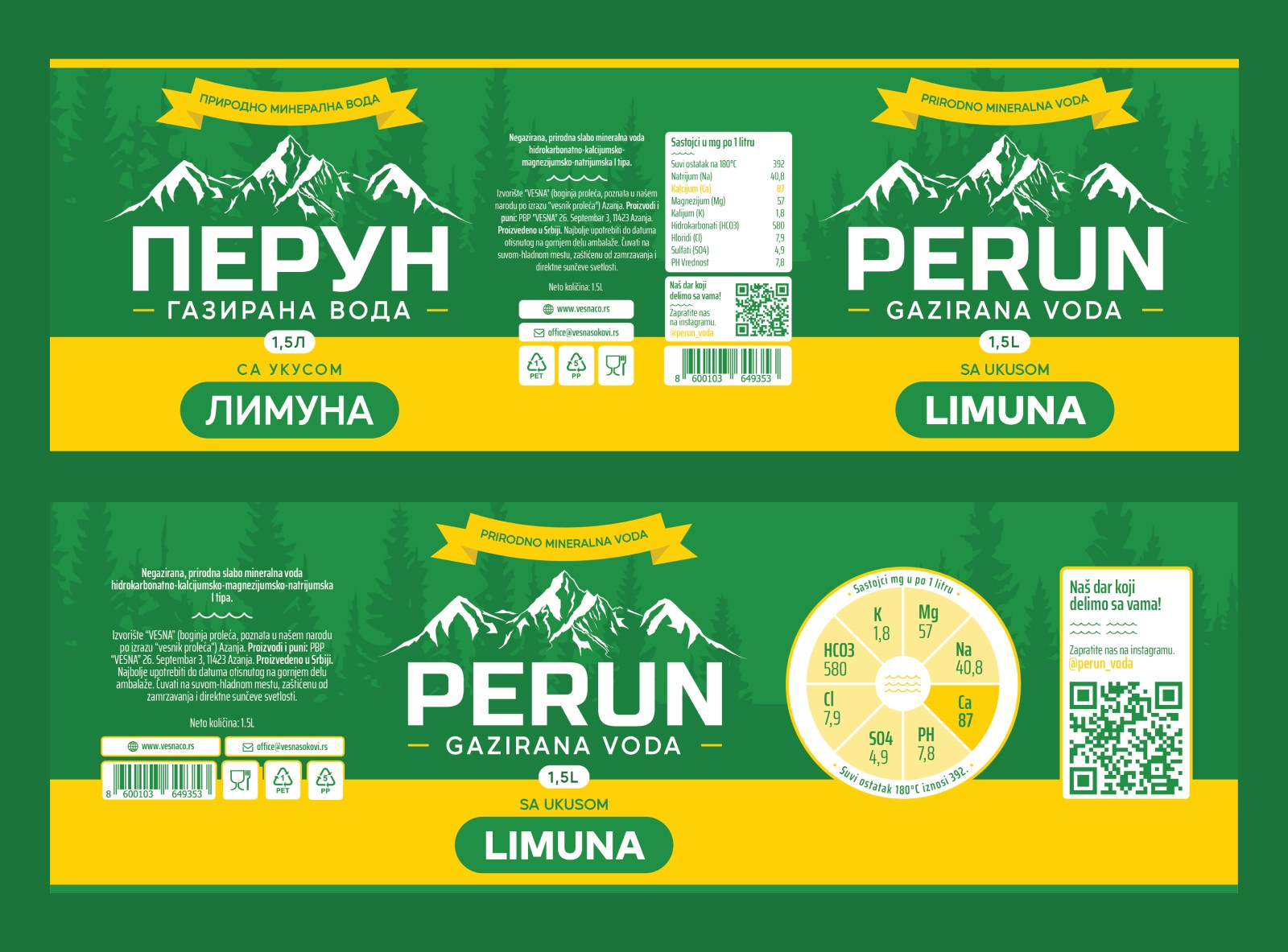
We started by designing a fill shape that would wrap around their mountain logo, extending above to create the desired transparent section. As the project progressed, our work expanded to include two additional labels: one for sparkling water and another for lemon-infused water.
Results
In the end, we delivered a modernized design that seamlessly fit within their price range while staying true to the brand's traditional appeal. The updated labels not only enhanced visual appeal but also resonated strongly with their target audience, ensuring the brand remained accessible and relevant in its market.
Similiar Projects
Let's Collaborate
I'm currently open to full-time positions and freelance projects. If you think we'd make a great team, don't hesitate to reach out— let's create something amazing together!
